Flash surface design one step ahead
Shinichi Kobayashi
―― Role of Mirage
The development of the Mirage was a new challenge for Mitsubishi. It was an exclusive model to be launched through Mitsubishi’s second dealership channel, Car Plaza. Building on the success of the Colt Galant, the Lancer, and the Galant Sigma, Mitsubishi was looking to further expand its business by having two sales channels. Furthermore, the Mirage was Mitsubishi’s first FWD car. In Japan, the Honda Civic, launched in 1972, was a FWD 2-box car that became a worldwide hit, changing the image of the compact car up to that time. FWD cars with excellent space efficiency had become a global trend. The Mirage was also planned to fill the gap between the Lancer and the Minica, and at the same time, it was a car that would be marketed globally in North America, Europe, and Oceania.
―― Six 1/5th models
From the outset, there were high expectations for the design of this project. This was because President Kubo prides himself on being “picky about styling,” and this had been proven with the Sigma and the Lambda. A half-baked design would not get approval. However, several 1/1 models were made for two stages, but they failed to meet the president’s expectations, and the development reached an impasse.
Sketch review in team
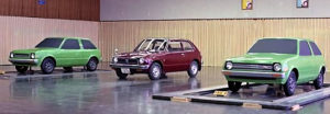
Comparing early clay models with competitor
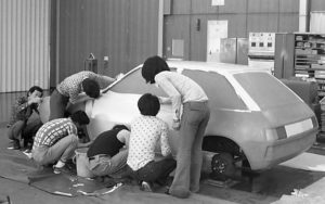
2 clay models in early stage
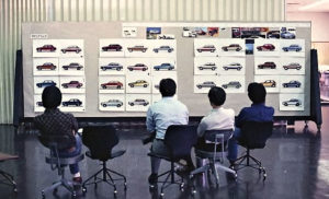
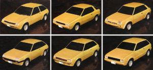
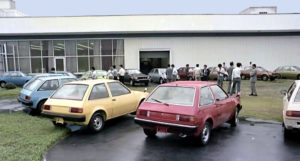
Therefore, it was decided to return to square one, gather as many designers as possible within the design section, and create six 1/5th models at once. We also decided to run the models through a design clinc to at least get some direction. A clinic does not necessarily tell us the right answer; it is a question of how we judge the results. Therefore, we decided to make a decision beforehand, focusing on the aim and potential as a product, rather than on the ranking by the evaluation points.
Masao Oshima (right) checking 1/5 clay models with team members
Presentation of 1/5 clay models in design section
Masao Oshima (deceased), who designed the chosen proposal out of the six that were submitted to the clinic, described the time in the following way in an in-house document compiled by the design department about 20 years later.
We were handed the baton in the middle of the project, but it was difficult to create an approval model even after we became the project team. I think one of the reasons was that the project group (the group responsible for the overall development of each model) had strong intentions (especially low cost) and tied us down too much. We were stuck in this situation, and at the discretion of the design section, six designers competed to restart the project. In this way, we could test our skills freely. Modeler Yutaka Ito was assigned to work on my model. I think the biggest reason my idea was chosen was his skill and good sense.
The presentation for approval was made to Kubo, the president, in a conference room of the head office, accompanied by the modelers. Shozo Morimoto, who was in charge of the product planning and the creator of the keywords “Soft & Cool,” came in unexpectedly in the middle of the meeting and reported the results of the in-house clinic conducted the day before, saying, “Two models were particularly good,” and Kubo easily selected one. After that, all I did was to make a panel that said “FAMILY TOOL” and put it on the wall, which was laughed at by the Chrysler people (it meant a family planning tool!). I did almost nothing, and Shinichi Kobayashi, Hiroshi Mizutani, and Michiro Eguchi, who had just joined the company, did most of the work for me.
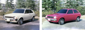
Top left, approved Oshima’s 1/5 model with full-frame pressed doors
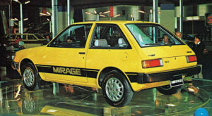
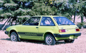
Oshima’s proposal A, which was selected, was an unprecedented full-frame pressed door design for a domestic car at the time, with doors that went all the way to the roof, and a fresh design that integrated the lower body and cabin with a rich taut surface. In developing the Mirage, President Kubo had set the goal of “less bulky, roomier” meaning that a compact body with ample space would achieve both world-class energy-saving performance and comfort. The design proposed by Oshima, with its apple-like outward tautness, must have convinced Kubo that this was the design he was looking for. In fact, this proposal was the second most favored in the clinic, but Kubo made his decision based on his own eyes, not on the results of the survey.
Oshima’s design theme for his proposal was “Apple = Fresh + Rich”. This became the basis for the promotion of the Mirage, which emphasized freshness and used the “green apple” as a design motif at the time of its launch.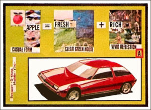
―― Flash surface design
After the design direction was narrowed down, we entered the 1/1 clay model stage, and I took on the overall body planning with Oshima. Oshima was inspired by the design around the doors of the American Motors Pacer, which had appeared around that time. The pacer’s exterior design was much cleaner and more aerodynamic than the drip-channel protruding designs of earlier cars. In those days, President Kubo’s directive was “…to aim for a car that is one step ahead of the competition…” in any case. We called this treatment around the doors, which was still unprecedented among Japanese cars, the “slippery body”. To realize this, we challenged the door area structure of the full-frame pressed door concealed drip system. I believe that the reason this was realized was due to the persistent efforts of the studio engineers and the body design engineers. Eventually, we came to call this “slippery body” a “flush surface”.
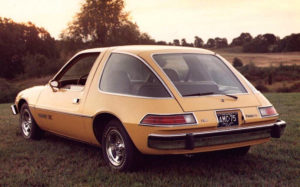
AMC Pacer debuted in 1975
Clay model under surface treatment study
―― Detail design
While working on the clay model, Oshima and I spent a great deal of time developing the surfaces and tuning the silhouette, considering how to create beauty and high quality with only a simple, modern basic form. Oshima was particular about the basic design, but he had an easygoing personality that left the rest of the work to me, which made it easy for me to work with him.
Writer(Left)examining detail on tape drawing
DI-NOC sheet work by designers and modelers
Hiroshi Mizutani was in charge of the front design, which was planned with new SAE standard headlaights informed by our partner Chrysler. This front design was clean yet distinctive, recognizable at a glance. The front bumper is composed of roll-formed sheet metal, painted black, and fitted with stainless steel panels, giving it a functional, unpretentious quality suitable for a compact car. The fender mirrors, which he also designed, were a witty feature, repeating the hexagonal cross section of the car’s body.
When the car was completed and tested on the proving ground in Yatabe, it was found that the rear end shook up and down at high speeds, so the upper part of the rear gate mold was hastily modified and a lip was added. This was done by Michiro Eguchi. He also designed the dish-type aluminum wheel, which matched the exterior image very well.
―― Compliments from experts
In the March 1978 issue of Car Styling magazine, chief editor Akira Fujimoto described the Mirage’s design as follows
There are not many mass-market cars in the world that have such a meticulously planned style. (omission) The process of developing the surfaces of this car in the clay model stage is not disclosed, but the appearance of the production car suggests that it was designed with a level of care and attention that is not common in the world. (omission) The relief lines are modest, and there are no signs that the detailing was intended to be vulgar taste. The styling is pure. On the other hand, however, the emotion of the design is restrained. The sense of dynamism is also de-emphasized. The “dynamic quality” of the Nissan Skyline, as described by Kyoichi Yamaguchi (a journalist), is not the style theme of this car. The car is oriented toward “high quality,” not “dynamic quality. The roughness often seen in Japanese cars has been eliminated.
Oshima described his experience at the Tokyo Motor Show in the fall of 1977, when the Mirage was unveiled.
I was standing in front of the Mirage as a guide when Soichiro Honda suddenly arrived, and he was glued to the Mirage. Because it had the same full-frame press doors as the Prelude, a special coupe that was announced at the same show. I was also happy that Chuck Jordan, GM’s design boss then, told me that it was the best design of the show.
Chuck Jordan looking at Mirage at Tokyo Motor Show
Image source: Motor Fan Dec. 1977 issue
Furthermore, at the 49th Geneva International Motor Show the following year, it won first place in the Most Beautiful Award in the 3-door category. We were very honored to receive these compliments. The treatment of the Mirage’s door area required larger tooling and higher initial costs compared to previous models. At that time, I heard some designers of other companies say that Mitsubishi designers were fortunate to have the technical and financial support they needed. However, even in my long experience, this period when President Kubo was leading the development while being concerned about the car design was special, and even those who were usually fussy about costs were quiet in front of him. Flash surface design was costly at the time, but by the 1980s it had become an important factor in improving fuel efficiency, and it was widely used in Europe, eventually becoming the norm.
―― Mitsubishi’s biggest hit
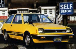
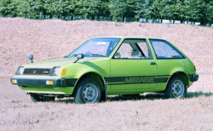
The Mirage was launched in 1978 and became Mitsubishi’s biggest hit ever. In North America, it was sold as the Dodge Colt and Plymouth Champ by Chrysler, and it received the number one fuel economy rating from the U.S. Environmental Protection Agency (EPA) at the height of the second oil crisis. In Japan, it was also a good thing that the Mirage Bowl and other unparalleled campaigns themed around the American West Coast, which were the brainchild of Shozo Morimoto, the Product Planner, were successful.
Looking back, I believe that the Mirage’s design was born from President Kubo’s commitment to beautiful design and to being one step ahead of the competition, and that the designers in charge of the project demonstrated their creativity to achieve this goal.
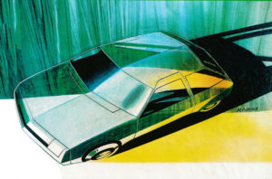
Image sketch by Masao Oshima drawn after work completion
Feb. 2022
Color design characterized by vividness
Hiroshi Yoshihira
―― California lifestyle as theme
The 1st gen Mirage (hereafter Mirage) is a memorable model that I was given the opportunity to work on from the concept planning stage of color design to design approval for the first time in my third year with the company. Its development started around 1975, three years before its launch.
At the time, the 2-door hatchback market was popular among Japanese young people, and the Mirage was late to the party with the Honda Civic and Mazda Familia, so we were conscious of creating a fresh appearance through color design. However, the cost of the color design was extremely tight for a popular car, and the team struggled to find a way to create a high-quality, effective color scheme without spending money on an innovative styling design. Since the car was initially developed only as a 2-door hatchback, the scheme was designed with an awareness of the youth lifestyle of California in the U.S., which was becoming popular in Japan at that time.
―― Aiming for “Vividness”
For the body colors, vivid solid colors (yellow, green, etc.) were chosen as the theme colors, rather than metallic colors, which were inferior in color reproducibility at the time of the technology level. For the interior colors, we adopted highly saturated orange and green, which were epoch-making at the time. The reason for this was that most grades could not afford to spend much on seat materials, so we had to use plain knit, resulting in a characteristic color scheme. As a consequence, we were able to create a simple and modern interior. The top-of-the-line version, which allows us to spend more on seat materials, comes with an ivory-white interior, which was often used in high-end sporty cars. We adopted an elegant checkerboard pattern fabric for the seats. As described above, both the interior and exterior colors were vivid and unlike any other Japanese cars of the time, and the color coordination created a fashionable impression.
Scene of coloring review meeting in design studio courtyard
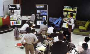
Coloring review meeting with relevant departments
―― Presentation in Chrysler style
The color design proposal was put together, but a difficult challenge awaited us. How to get the executives and conservative sales department, who were far removed in age from the target users (young people), to approve a novel proposal that had never been seen before on Mitsubishi cars? After much deliberation, we devised a design presentation for the approval meeting. Taking Chrysler’s color design presentation method as a reference, we decided on image keywords for each interior color, and created interior and exterior color coordination panels to make the explanation easier to understand.
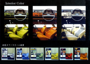
Interior and exterior color coordination panel
―― Looking back
The hard work was worth it, and the color design proposal was approved and mass-produced almost exactly as proposed. Looking back, it can be said that the importance of color design was recognized later at Mitsubishi than that of styling design. It was around the time of the 1st gen Mirage that developments began to focus even more on color as an element for capturing the hearts and minds of users. Since then, the importance of color has increased, and it is deeply impressive that color now plays a major role in vehicle marketability at the level of sensory quality (a sense of quality that can be seen and felt), rather than just color and material. As an alumnus of Mitsubishi, I am very happy to hear that the color design of Mitsubishi vehicles is highly appreciated in the market, and I look forward to its further development in the future.
December 2021